Visual Branding For SaaS: Your 2026 Checklist
Build clarity, consistency & trust. Use our 2026 SaaS visual branding checklist to stand out with a brand that feels uniquely yours.

Visual branding for SaaS in 2026 is about clarity, consistency and character: a system that feels unmistakably “you” across marketing and product, while staying fast, accessible and trustworthy for users who live in your UI all day. SaaS branding is crucial for SaaS companies looking to stand out and build trust in a crowded market, where differentiation and recognition are key to growth.
Visual branding is more than just a logo; it’s about building a comprehensive SaaS brand identity and brand identity that includes not only visuals but also messaging and perception. Use this checklist as a working brief you can hand straight to your design team or agency to audit and refresh your brand.
Book a free brand design day
Start with a quick brand identity audit
Before tweaking colours or finessing buttons, check whether the current identity still matches your positioning, audience and product roadmap. Key actions:
- Review where your brand shows up: website, app, onboarding, emails, sales decks, social, partner listings and marketplaces.
- Collect real feedback: run a quick survey or interviews with customers, sales and success teams to ask how the brand “feels” versus what you want it to signal (e.g. enterprise, playful, premium, efficient). Be sure to assess key metrics like brand perception and brand recall to understand how your brand is recognized and remembered.
- Map competitors: screenshot 10–15 direct and aspirational competitors and note their dominant colours, logo styles and UI vibes to avoid blending in. Understanding the competitive landscape is crucial for identifying opportunities to differentiate your SaaS brand.
- Decide the gap: write a one‑sentence “from → to” statement (e.g. “From generic project tool → to sharp, data‑driven ops platform”) to anchor all visual decisions. Clarify your value proposition in this process to ensure your messaging highlights your unique benefits.
Understanding these core concepts in SaaS branding during your audit will help you build a foundation for effective visual branding for SaaS.
Your Visual Brand Identity For SaaS Checklist
Typography: hierarchy, usability, and personality
Your type system is a core part of your brand's visual and verbal elements, carrying as much personality as your logo but also having to survive dense dashboards and long‑form content.
Checklist:
- Pick a clear type hierarchy: define exact font families, weights and sizes for H1–H6, body, captions, buttons and data labels across marketing and product.
- Screen‑first selection: choose web‑safe or licensed web fonts designed for digital use, with good legibility at small sizes and on low‑contrast backgrounds.
- Limit the set: most SaaS brands do best with 1–2 families (e.g. sans for UI, serif or display for accents) to avoid visual noise and performance hits.
- Encode semantic usage: document where each style belongs (e.g. “H2 = section titles in docs”, “Button label = 14px / medium / all screen sizes”) so devs never guess. This documentation helps ensure your typography consistently expresses your tone of voice and reinforces your brand voice across all platforms.
- Check accessibility: verify line length, size, weight and contrast meet accessibility recommendations, especially for core flows and long‑form help content.
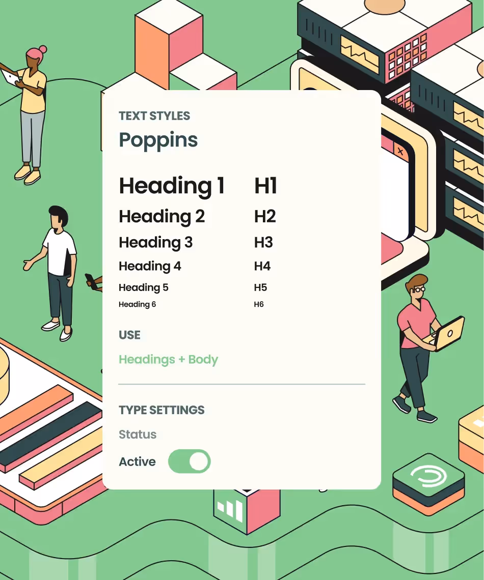
Typography Styles For TEP (Teacher Engagement Platform)
Logo: simple, scalable, systemised
SaaS logos are just one of several visual elements and brand elements that make up a SaaS brand identity. Now, logos need to work everywhere from tiny navbar favicons to AI‑generated cards and in‑product micro‑surfaces.
Checklist:
- Check scalability: test your primary logo at multiple sizes (favicon, mobile header, desktop nav, slide corner, app tile). If it turns to mush at 16px, simplify shapes or move to an icon‑plus‑wordmark system.
- Create a clear logo set: define primary, horizontal, stacked and icon‑only versions, with minimum sizes and clear‑space rules so nobody has to take guesses in Figma at 11pm. These visual elements should be consistent across all brand touchpoints.
- Define background rules: specify when to use full‑colour, monochrome and reversed versions, and which backgrounds are forbidden for legibility or contrast.
- Capture misuse examples: add a “don’t” page showing common errors (squash, recolour, add shadows, rotate, put on clashing gradients). This saves endless Slack debates.
- Align with product iconography: if your app uses a strong icon language, ensure the logo icon feels like part of that family, not a random guest. The logo should work cohesively with other brand elements to reinforce your SaaS brand identity.
Colour systems: brand, functional, and accessible
In 2026, strong SaaS colour systems separate “brand” colours from “functional” UI colours so emotion never fights usability. Establishing visual consistency and a visually appealing color system is essential for building trust and recognition in SaaS visual branding.
Checklist:
- Separate brand vs UI roles: define primary and secondary brand colours for marketing, then a distinct functional palette (success, warning, error, info, neutrals) for product.
- Build tokenised scales: create 8–10 step scales (e.g. blue‑50…blue‑900) and name them with tokens your dev team will actually use (e.g. –blue-600, –danger-500).
- Prioritise accessibility: test contrast for text, icons and key interactive elements; document “do not use” combinations for buttons, alerts and charts.
- Own a recognisable accent: pick one distinctive accent colour or gradient that can signal your brand in screenshots, ads and integrations without shouting.
- Plan for dark mode: define how your palette adapts for dark themes (backgrounds, neutrals, brand accents and functional states), rather than inverting colours ad hoc.
- Document usage rules: ensure all color usage guidelines are clearly documented to maintain brand consistency and reinforce your visual identity across all touchpoints.
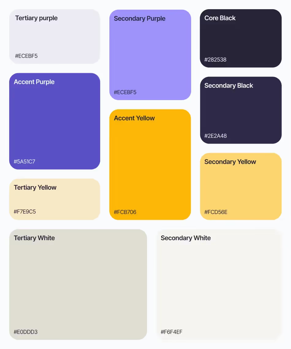
Colour Design System For Parsel
UI and UX brand consistency: design system, not design chaos
Your product UI is now the primary brand touchpoint; ensuring consistency across all customer touchpoints is crucial, as inconsistent in‑app design erodes trust faster than any off‑brand ad.
Checklist:
- Centralise a design system: maintain one shared library (e.g. in Figma) with buttons, inputs, tables, modals, cards, navigation and layout patterns tied to tokens. This design system should be built on a comprehensive brand system to maintain consistency across updates and design choices.
- Define interaction patterns: standardise states for hover, focus, error, loading and disabled across components, including motion rules for micro‑interactions.
- Align marketing and product: ensure marketing visuals of the product match real UI patterns and states; no fantasy dashboards that users never actually see.
- Audit “rogue” UI: review legacy flows, admin panels and rarely touched modules where old colour or type decisions lurk, and add them to a deprecation plan.
- Bake in accessibility: encode keyboard navigation, focus styles, text resizing and error feedback into your system, not per‑feature.
Maintaining consistency through a strong brand system directly impacts customer experience, building trust and reinforcing your SaaS brand at every customer touchpoint.
Auditing your own system honestly is the hard part. Internal teams are too close to the work to see where consistency has quietly slipped, and legacy flows tend to get graded on a curve. If you don't have the bandwidth to run this rigorously in-house, it's worth getting an outside read from a specialist SaaS design agency before committing to a full refresh; an objective audit usually surfaces the rogue UI you've stopped noticing.
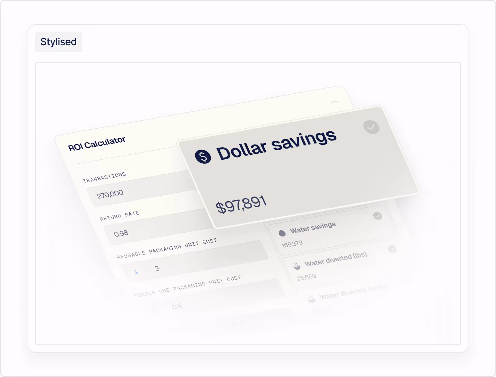
Imagery: humans, product, proof, and brand values
Imagery is where your SaaS stops feeling abstract and starts feeling like a real tool used by real teams. The imagery you choose plays a crucial role in your marketing materials and branding materials, helping to maintain a consistent and engaging visual identity across all touchpoints.
Checklist:
- Choose a primary imagery style: decide whether your brand relies on product‑first UI mockups, illustration, photography, 3D or a mix, and write that down. The imagery style you select should help communicate your brand story, visually expressing your brand’s purpose, values, and unique identity.
- Product screenshots with intent: specify how to crop, clean and style screenshots (e.g. simplified data, on‑brand empty states, consistent browser chrome, rounded corners).
- Human imagery with boundaries: define what “real people” look like in your brand (diversity, settings, expressions) and avoid the generic “stock‑team‑pointing‑at‑screen” trap.
- Illustration guidelines: if you use illustration, specify line weights, shapes, shading, motion and how characters or scenes represent your audience.
- AI imagery rules: decide when AI‑generated visuals are acceptable, what prompts/styles are allowed, and how to label or avoid them in sensitive industries.
Like our work? Book a call
Practical handoff: what to give your team or agency
Turn this into a concrete brief so your designers can move fast and consistently. Collaborate with a SaaS branding agency or branding agency for expert support to ensure your branding efforts are strategic and aligned with industry best practices.
Create or update:
- A 1–2 page brand positioning overview: audience, brand promise, brand messaging, brand values, core values, personality traits, brand personality, brand stands, and a “from → to” statement to frame the visual refresh. This overview should clarify how your brand reinforces its identity and what your SaaS business stands for in the competitive SaaS market and SaaS industry.
- Visual identity guidelines: logo system, colour tokens, typography, imagery rules, and example layouts for web, app, and slideware. Ensure these guidelines reflect your SaaS company's brand identity and support strong brand presence, brand recall, and a brand memorable experience for both current and potential customers.
- Product design system spec: component library with clear naming, usage rules, and accessibility notes, linked to the brand guidelines. This should be consistent with your SaaS product or SaaS solution, and serve as a benchmark alongside successful SaaS brands, SaaS branding examples, and B2B SaaS leaders.
- Rollout plan: prioritised list of where to update first (homepage, nav, pricing, core app flows), with owners and timelines so the new system actually ships. Integrate your marketing strategy and plan targeted marketing campaigns to reach potential customers, drive user engagement, and support customer retention and customer loyalty.
These branding efforts and successful branding efforts contribute to business growth, driving business growth, and building a competitive edge. They deliver key benefits such as strong brand presence, brand building, and brand perception, helping your SaaS business remain relevant among SaaS startups and within the broader SaaS community. Track metrics like brand recall, brand perception, and competitive edge to measure the impact of your strong SaaS brand and ensure long-term success.
With those pieces in place, your 2026 SaaS brand will feel sharper, more cohesive, and far easier for every marketer, designer, and developer to use consistently.
SaaS visual branding trends to keep or skip for 2026
Not every trend deserves a spot in your roadmap; use them intentionally to support your positioning.
Partner With Design Experts Who Speak SaaS
If the checklist above feels like more than your internal team can tackle alone, Overpass Studio offers a flexible alternative to hiring in-house. Our Pro Brand Design subscription service connects B2B SaaS teams with senior designers who specialise in the exact challenges outlined in this guide—brand identity audits, design system builds, and marketing asset production—all for a fixed monthly cost starting at £1,950.
Overpass operates as a fractional design team, meaning you get instant access to strategists, creative directors, and designers with deep B2B expertise, without the overhead of recruitment or onboarding.
Book a free brand design day
Get in touch