15 Best B2B SaaS Landing Pages in 2026 (With Design Takeaways)
8 high-converting SaaS landing pages for 2026. Real examples, UX patterns, and design takeaways to boost your conversion rates.

The best SaaS landing pages don't just look good, they convert. They turn a first-time visitor into a demo booking, a free trial signup, or at minimum a convinced prospect who returns. In 2026, the gap between a landing page that ranks and one that converts has widened significantly: the pages winning on search are the ones that go deepest on real examples, specific design patterns, and tangible takeaways.
This roundup covers 15 of the best SaaS landing pages live right now, broken down by sector and use case. For each one you get the specific SaaS web design and conversion decisions that make it work; real patterns you can pressure-test against your own page. Whether you're redesigning landing pages from scratch or optimising a specific page that's already live, these page examples are the benchmark.
Concerned about your own conversions? Grab a free conversion audit
15 Best SaaS Landing Pages in 2026 (With Design Takeaways)
Each example below targets a specific SaaS category. The breadth is deliberate: landing page patterns that work in fintech don't always translate to edtech, and what converts for a PLG product is different from a high-ACV enterprise motion. Read across categories to find the patterns most relevant to your product.
Logistics tech: Parsel
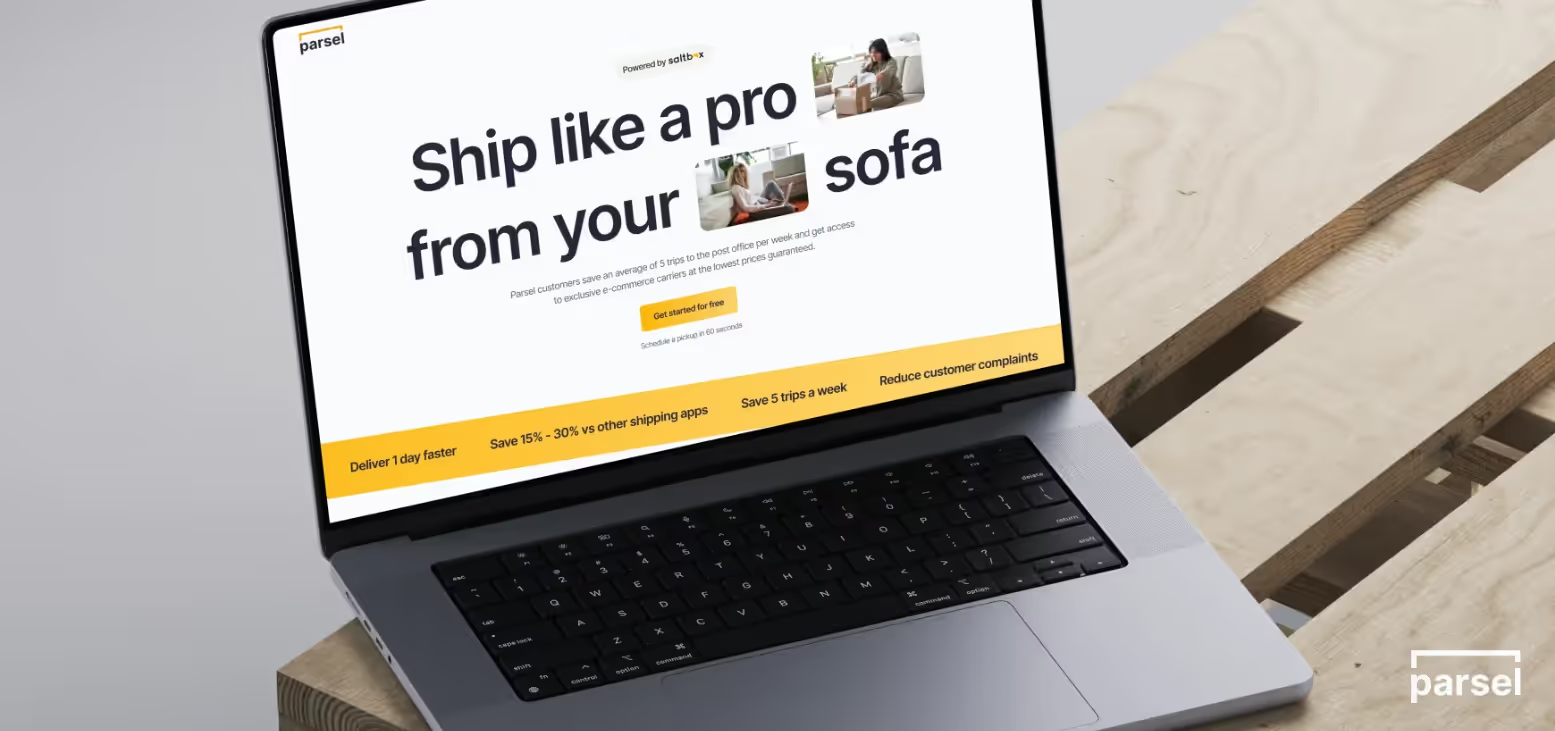
Parsel's site leans into trust-building for complex logistics with clean layouts, confident typography, and a calm, muted palette that feels operational rather than flashy. The product UI is framed in real-world context (parcels, routes, workflows), helping visitors immediately connect screens to outcomes like faster delivery and fewer errors.
We designed and built Parsel's landing page in a two-week sprint; their first web presence as an early-stage logistics SaaS. The result: 5x sales increase, 50% cost savings reported, and 100k brand impressions within the first campaign cycle. The core design decision was restraint: a muted palette and operational typography that signalled reliability before a single line of copy was read.
What to steal for your landing page:
Use a restrained colour system and bold type hierarchy to signal reliability for mission-critical tools. Show UI within real logistics scenarios (maps, schedules, tracking views) rather than floating screenshots. Keep hero copy short, direct, and outcome-focused for time-poor operations leaders.
Design and prototyping tech: Figma
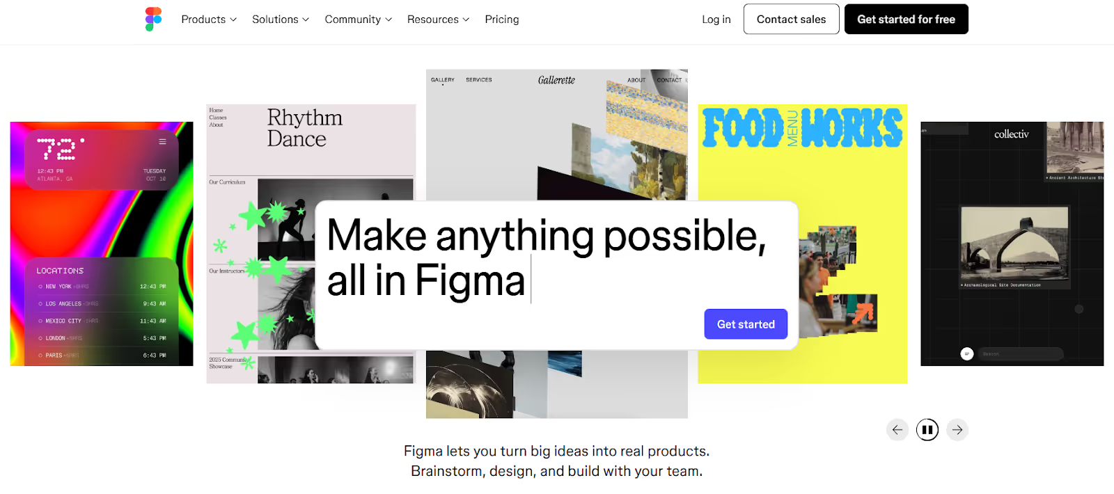
Home Landing Page For Figma
Figma uses collaborative cursors, live cursor animations, and interface mockups to show how teams work together in the product, with motion dialed up on overview pages and dialed down on deeper product pages for readability.
The landing page's above-the-fold communicates collaboration as the product; not features, not pricing, not integrations. The moving cursors and overlapping user avatars make the value proposition visceral before you've read the headline.
What to steal for your landing page:
Visually dramatise your core differentiator above the fold, as Figma dramatises collaboration. Reserve heavier animation for high-level storytelling; keep product detail pages calmer for readability. Tie navigation and illustrations directly to product use cases.
Task management tech: Asana
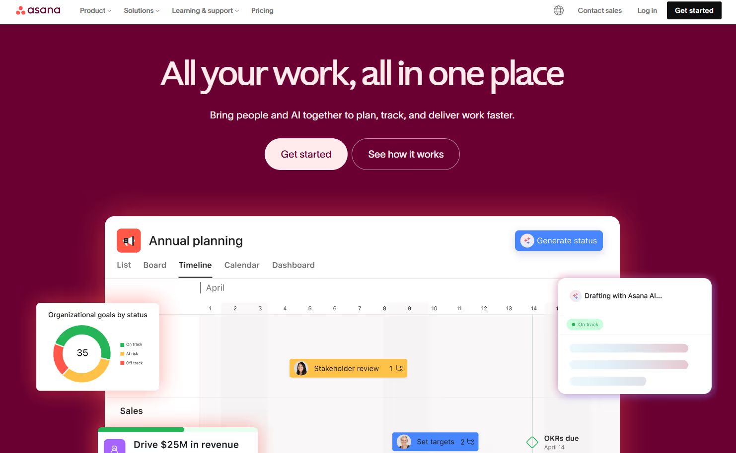
Home Landing Page For Asana
Asana prioritises clarity over spectacle, with highly legible typography, generous white space, and minimal motion so visitors can digest messaging without distraction. The mega-nav is large but carefully structured, enabling self-serve education across use cases, industries, and templates without forcing a sales conversation.
The landing page architecture is built for multi-persona traffic. A project manager, a marketing director, and an ops lead all land on the same homepage, and all find a path to their specific use case within two clicks. That's the conversion pattern worth studying: navigation that does ICP sorting so the CTA page doesn't have to.
What to steal for your landing page:
Use ample white space and simple colour blocking to make dense information feel approachable. Keep animation subtle and purposeful. Invest in a structured mega-nav that routes different personas into tailored paths rather than a single generic hero CTA.
Fintech: Centrifuge
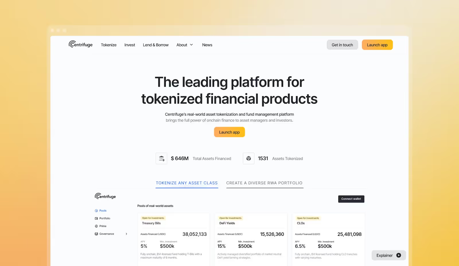
Home Landing Page For Centrifuge
Centrifuge presents complex financial infrastructure with a confident, modern visual language: dark backgrounds, precise type, and clear diagrams of flows between assets, investors, and protocols. Metrics and proof points appear early, helping sceptical buyers quickly understand credibility, scale, and risk posture.
The design challenge Overpass solved for Centrifuge was communicating DeFi infrastructure to a traditionally risk-averse finance audience. The solution: flow diagrams that abstract complexity, bold headline metrics that establish scale, and a dark-mode palette that reads as serious and technical without alienating non-technical buyers.
What to steal for your landing page:
Use diagrams and flow visuals to explain abstract mechanics in one glance. Pair bold visuals with concise proof (metrics, customer logos, case references) to build trust fast. Keep motion subtle and systematic for a financial brand that needs to feel cutting-edge but not playful.
Fintech: Ramp
.png)
Ramp Homepage
RHome Landing Page For Ramp
Ramp uses subtle motion, strong typography, and careful spacing to create a polished but unfussy financial brand that feels both premium and trustworthy. Interactions add tactility (cards sliding, balances updating) without overwhelming the layout, while structured sections make it easy to understand cards, spend controls, and automation at a glance.
What makes Ramp's landing page work specifically: the page is structured as a problem-product-proof sequence. Problem (your spend is uncontrolled), product (here's the dashboard), proof (here's what customers saved). That three-act structure is one of the highest-converting landing page architectures for finance SaaS.
What to steal for your landing page:
Combine high-contrast type with disciplined spacing to convey financial rigour. Use small tactile interactions on cards and UI modules to make the product feel tangible. Organise pages into clear problem-product-proof narrative blocks so evaluators can skim and still understand the story.
Edutech: TEP (Teacher Engagement Platform)
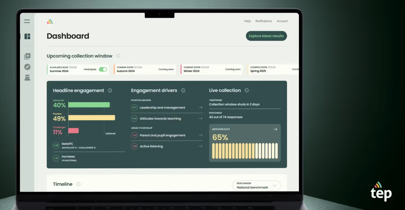
Dashboard Product Landing Page For TEP
Teacher Engagement Platform (TEP) employs the largest standardised question set to understand school staff and teacher engagement and its underlying drivers, managed and benchmarked via a user-friendly digital platform.
The design balances professional credibility with approachability through soft colour palettes, clear data visualisation, and intuitive navigation that makes benchmarking and reporting feel manageable rather than overwhelming. The landing page has to sell both to school leaders (credibility) and classroom teachers (ease of use) simultaneously, two very different buyer states.
What to steal for your landing page:
Use accessible visual hierarchy and gentle colours to make data-dense tools feel approachable for non-technical users. Frame complex metrics within familiar contexts so buyers immediately see the connection to outcomes. Design for fast comprehension with concise copy and visual summaries that respect time-pressed decision-makers.
7. Productivity SaaS: Notion
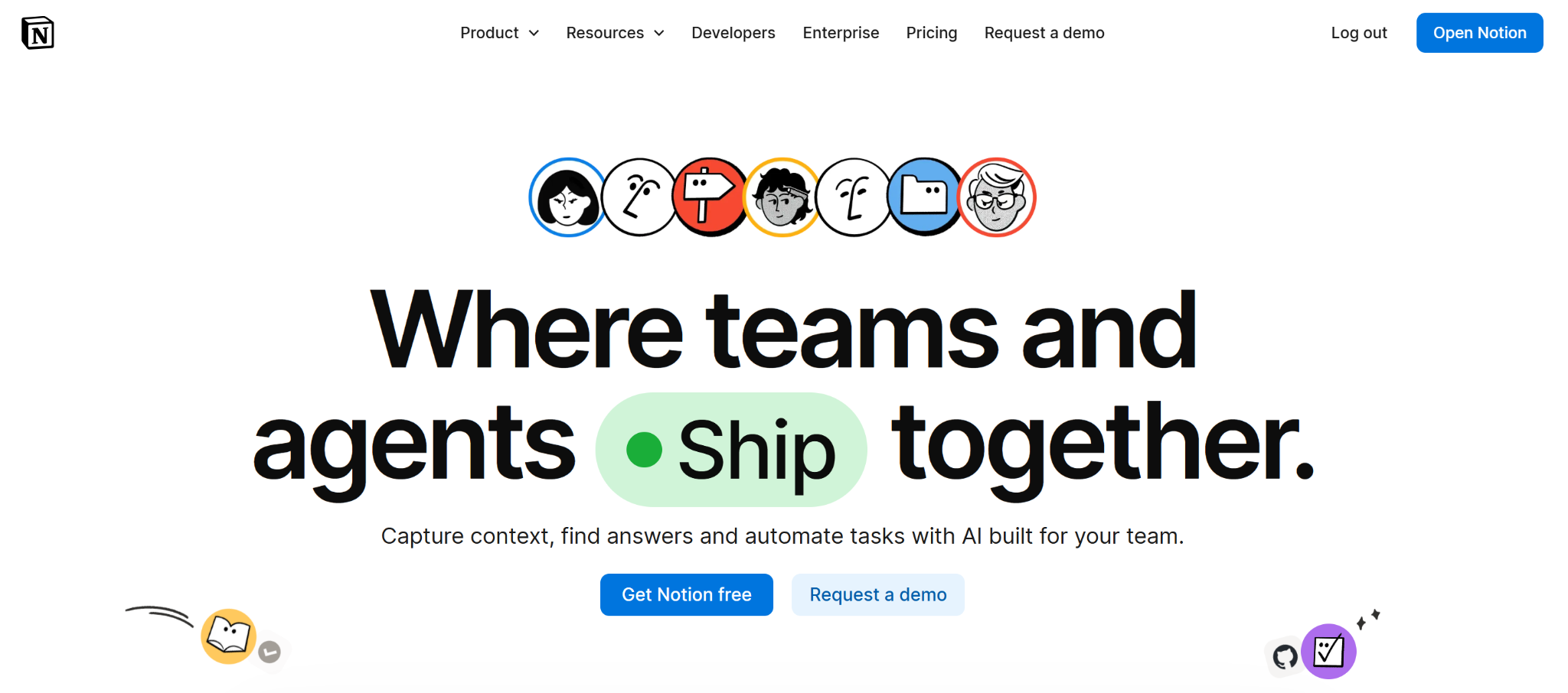
Home Landing Page For Notion
Notion's landing page is one of the most-studied in SaaS for a reason: it communicates infinite flexibility without inducing overwhelm. The hero avoids listing features entirely, it shows a single, clean workspace with the implicit message that this is the only tool you need.
The conversion pattern is social proof at scale. Notion surfaces recognisable logos, user-generated templates, and a 'made with Notion' community before asking for a signup. The effect is trust by osmosis: by the time you hit the CTA, you're not evaluating the product, you're just picking your plan.
What to steal for your landing page:
Lead with the simplest version of your product, not the most feature-complete one. Use social proof and community signals to do conversion work before the CTA. Show the product in a context that mirrors the buyer's own workflow.
8. Project Management SaaS: Linear
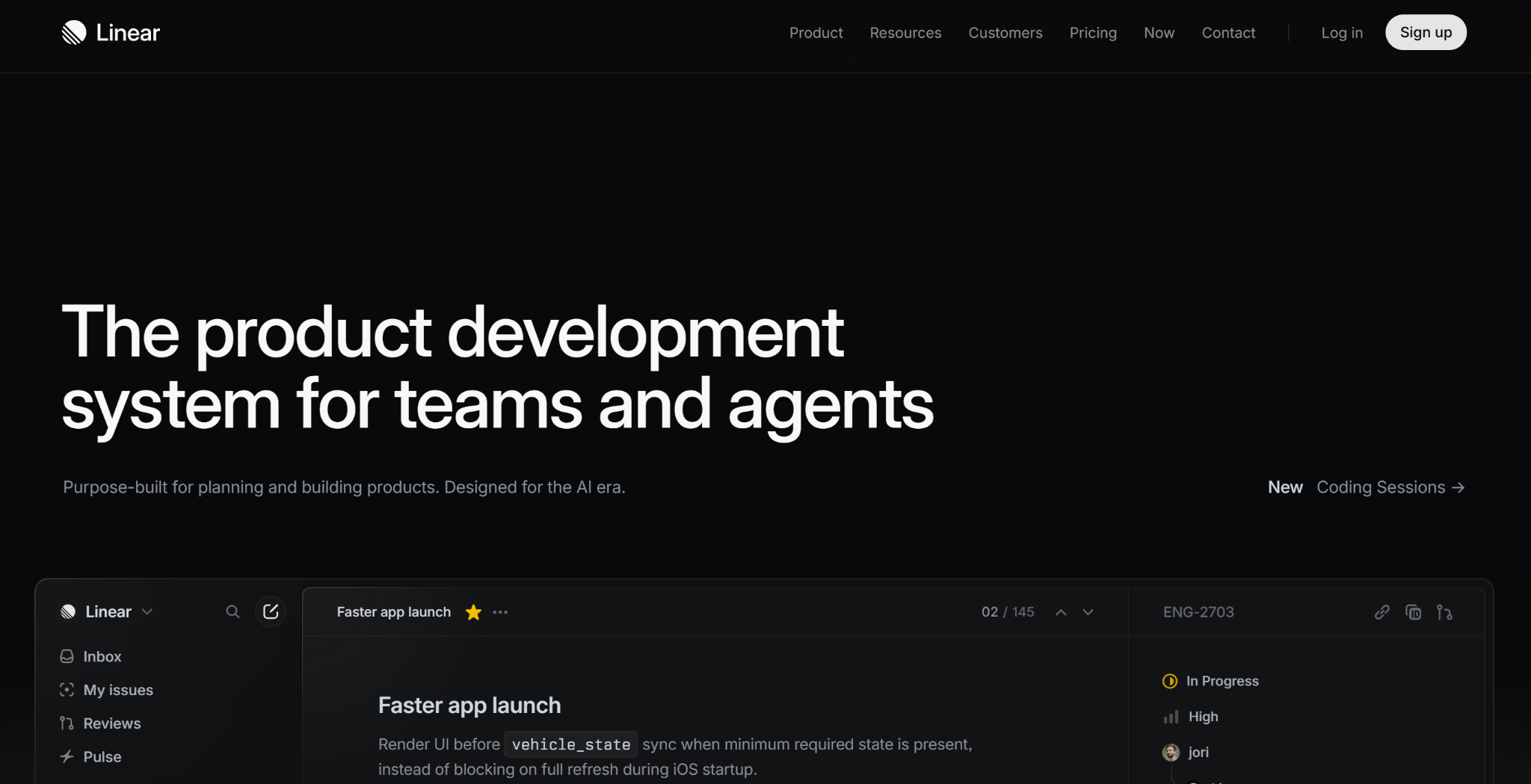
Home Landing Page For Linear
Linear's landing page is the cleanest in the project management category, and that's intentional positioning. In a SERP dominated by Jira and Asana's complex feature grids, Linear's minimal, opinionated design signals a different philosophy: speed and focus over configurability.
The above-the-fold communicates this in three words: 'The issue tracker for high-performance teams.' The landing page then earns that claim with social proof from fast-moving tech companies (Vercel, Loom, Railway) rather than enterprise logos. Every element of the page is doing ICP filtering.
What to steal for your landing page:
Use design minimalism as a positioning statement, not just an aesthetic choice. Choose social proof logos that signal the type of customer you want to attract. Write your hero headline as a complete position, not a tagline.
9. Customer Communications SaaS: Intercom
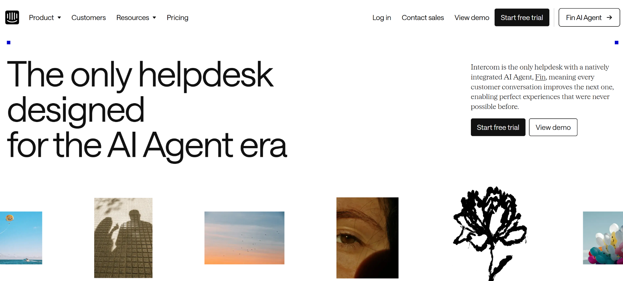
Home Landing Page For Intercom
Intercom's landing page has evolved significantly as the product has moved toward AI-first customer service. The current page leads with the AI agent (Fin) and uses a live demo module, meaning you can interact with the product before signing up. This is the boldest conversion mechanic on this list: let the product sell itself.
The design supports the live demo architecture with a clean background and restrained visual language that keeps attention on the interactive element. No animations competing with the demo. No hero copy fighting for focus.
What to steal for your landing page:
If your product can be demoed in 60 seconds without a sales call, embed that experience above the fold. Remove visual competition from the landing page when your primary conversion mechanism is interactive. Organise everything else (testimonials, pricing link, feature list) below the fold as supporting content.
10. Payments Infrastructure SaaS: Stripe
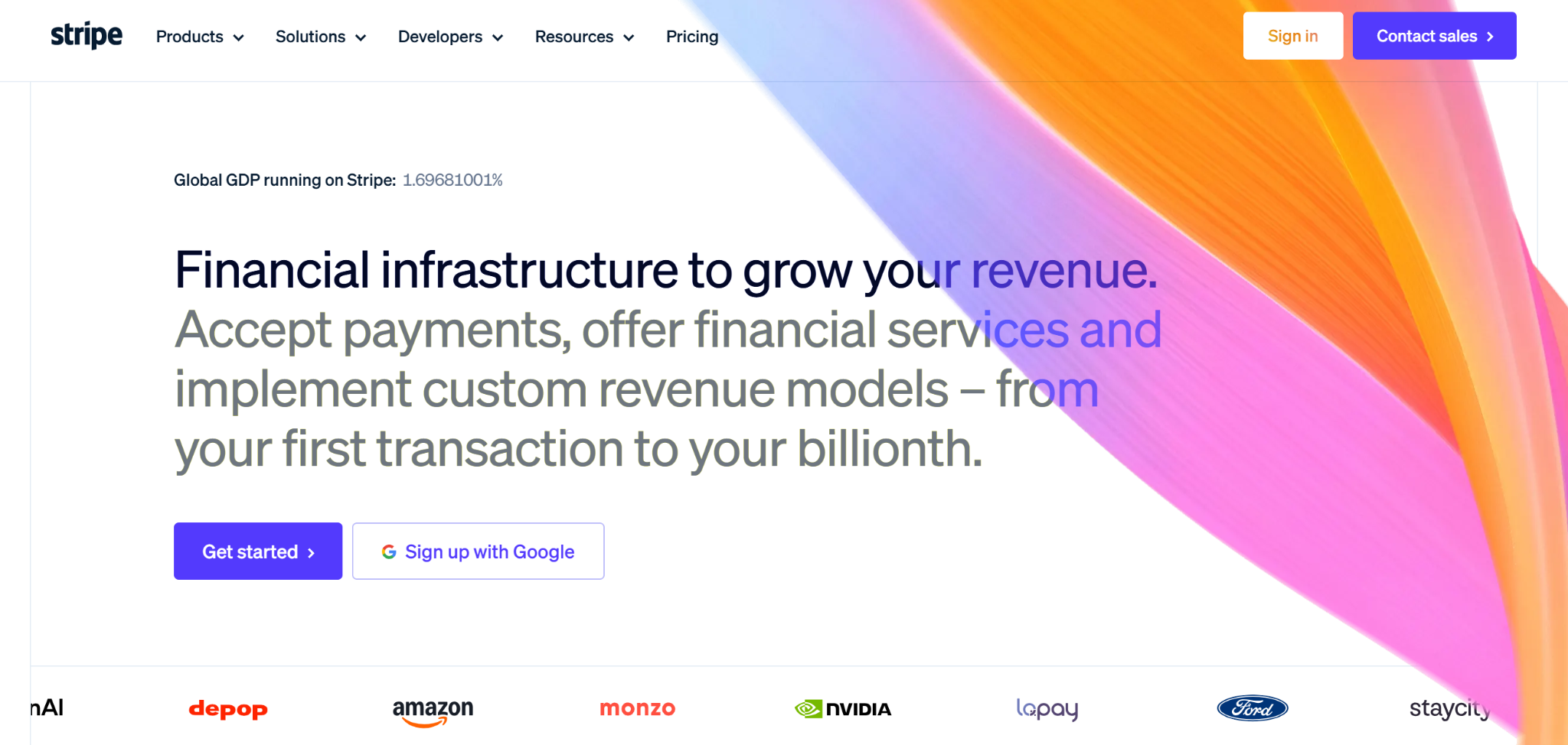
Home Landing Page For Stripe
Stripe's landing page is built for two audiences simultaneously: the developer evaluating technical fit and the finance leader evaluating commercial terms. Most SaaS landing pages fail when they try to serve multiple personas; Stripe succeeds by organising the page into discrete content zones that each audience can scan independently.
The above-the-fold serves both: a headline ('Financial infrastructure for the internet') that works for both personas, and a code snippet visible immediately that signals technical credibility to developers. Finance leaders scroll past it; developers read it. That one design decision removes a page worth of explanation.
What to steal for your landing page:
If you have two primary buyer personas, design discrete content zones for each rather than trying to write copy that serves both simultaneously. Use technical proof (code snippets, API documentation links) to do ICP filtering for developer audiences. Lead with infrastructure-level credibility signals before feature lists.
11. Async Video SaaS: Loom
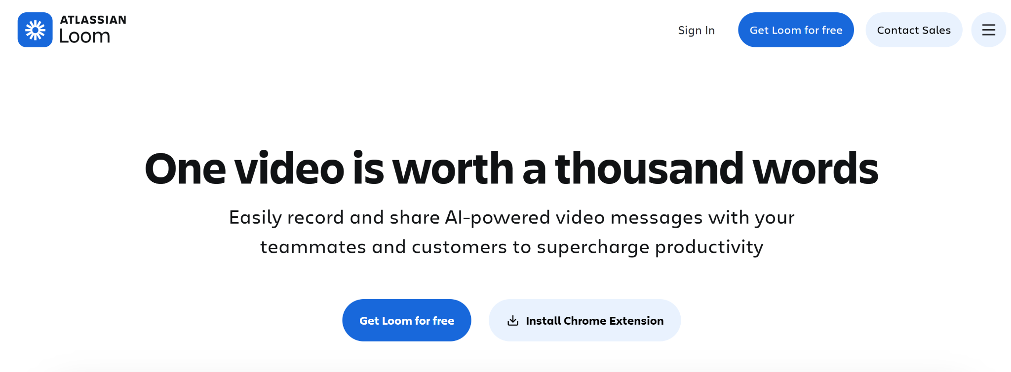
Home Landing Page For Loom
Loom's landing page does something rare: it uses its own product to market itself. The hero video is recorded in Loom. The product screenshots show Loom recordings. The testimonials are video-first. Every element reinforces the core value proposition, async video communication, without a single sentence of explanation.
The CTA architecture is worth studying too. 'Get Loom Free' is the primary CTA. ‘Contact Sales' and ‘Install Chrome Extension’ are positioned as secondary. That hierarchy is deliberate: for a product with a 60-second onboarding, the fastest path to conversion is the product itself, not a demo.
What to steal for your landing page:
Use your product's output to market your product where possible, it's the most efficient proof available. Make the free or trial CTA primary and the 'learn more' CTA secondary for PLG products. Design the social proof section to demonstrate the product's output, not just customer satisfaction.
12. CRM & Marketing SaaS: HubSpot
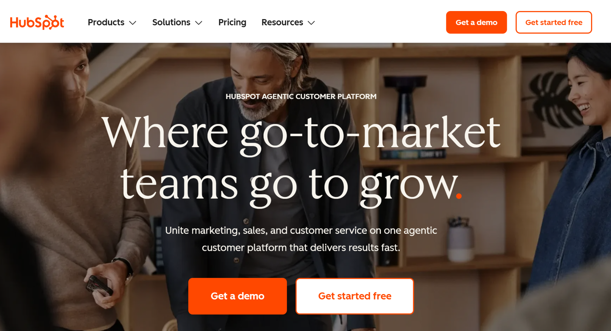
Home Landing Page For HubSpot
HubSpot's landing pages are some of the highest-trafficked in SaaS, and studying their architecture reveals why. Each landing page is hyper-specific to a single search query: 'free CRM', 'email marketing tool', 'landing page builder'. The above-the-fold matches the query intent precisely, with social proof calibrated to the buyer's stage.
For 'free CRM' landing pages, the proof is user count ('2 million+ businesses use HubSpot'). For 'enterprise CRM' landing pages, the proof is named enterprise logos. Same product, same company, two completely different landing page architectures, because the buyer state is different.
What to steal for your landing page:
Match your above-the-fold copy precisely to the search query that brings the visitor to the page. Calibrate social proof to the buyer's decision stage: volume proof for early-stage evaluation, named case proof for late-stage evaluation. Build separate landing pages for different query intents rather than one page that tries to serve all of them.
13. No-Code Web Design SaaS: Webflow
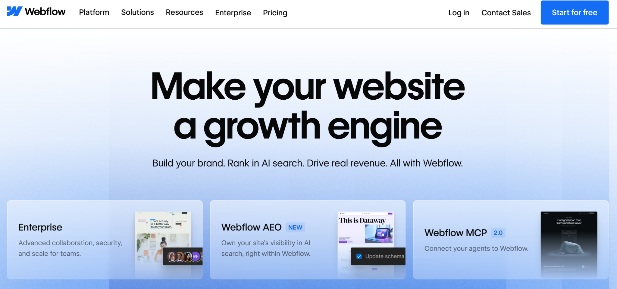
Home Landing Page For WebFlow
Webflow's landing page is itself an argument for the product: it's visually sophisticated, technically complex, and would be near-impossible to build without a capable CMS and design tool. The product marketing team uses every Webflow capability (CMS-driven sections, custom animations, interaction-heavy scrolling) to make the point viscerally.
The conversion architecture is primarily community and ecosystem driven. Customer showcases, template galleries, and expert marketplaces appear before pricing. The implicit message: this is a platform with a community, not just a tool.
What to steal for your landing page:
Use your landing page itself as a product demonstration. Show, don't just tell. For platform products, lead with ecosystem and community before pricing. Structure the page so that a visitor who scrolls past pricing still encounters the product's breadth via showcases and templates.
14. Construction Tech SaaS: ScaffoldBid
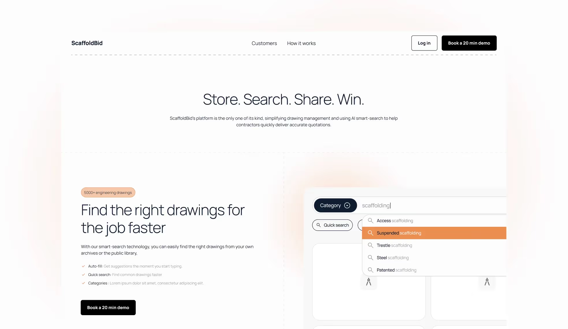
Home Landing Page For ScaffoldBid
ScaffoldBid arrived with a functional prototype and needed a landing page that could drive beta signups and investor credibility simultaneously, two very different conversion goals with different visual requirements.
We built ScaffoldBid's landing page in under a month. The design challenge was positioning a niche construction SaaS product to two audiences (scaffolding contractors evaluating the product, and investors evaluating the business) without splitting the page's conversion focus. The solution was a hero that speaks to contractor outcomes, with a credibility section positioned below the fold that serves the investor read.
What to steal for your landing page:
When your landing page serves multiple audiences, serve your primary buyer above the fold and your secondary audience (investors, partners) in dedicated below-the-fold sections. Don't let secondary audience needs dilute the primary CTA. A focused landing page converts better than a balanced one.
15. Logistics SaaS: Pimento
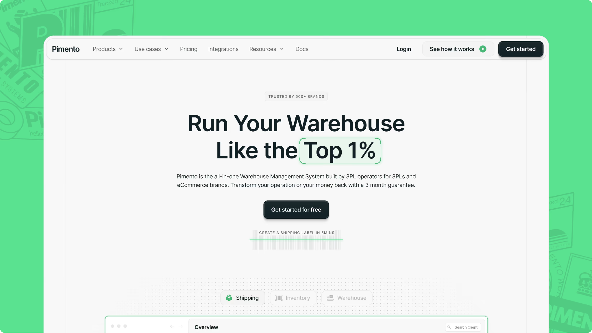
Home Landing Page For Pimento
Pimento's landing page solves one of the hardest SaaS landing page problems: communicating operational complexity to a buyer who has lived with the messy alternative for years. 3PL and warehousing buyers are not looking for 'modern', they're looking for 'won't break in a warehouse at 6am'.
The design language matches that buyer psychology: functional, reliable-feeling, with social proof anchored in operational specifics rather than generic testimonials. The hero copy leads with the problem solved, not the product's feature set.
What to steal for your landing page:
Design your landing page's visual language to match the buyer's existing mental model of the category, then deliberately position slightly above it. For operational software buyers, 'reliable' is a more powerful emotional trigger than 'innovative'. Lead with the problem eliminated, not the product added.
What makes a great SaaS landing page in 2026
Across all 15 examples above, six patterns separate the landing pages that convert from the ones that just look good.
Get your web conversion audit
The difference between a SaaS landing page that ranks and one that converts
The secret sauce behind these real landing page examples is partnering with a team that engineers your landing page as a high-performance revenue engine: built to qualify, nurture, and close, not just to sit there and look good in a Dribbble screenshot.
That means deep discovery with sales and marketing, ruthless clarity on ICP and positioning, and page flows built around how real deals actually move from 'curious' to 'close.' It's also about sweating the details: navigation that mirrors your sales process, messaging that handles objections before a demo, and UI that showcases your product in the exact moment a champion needs to sell it internally.
Through our B2B SaaS web design services and Webflow developments, we've built SaaS landing pages that drove 5x sales increases within the first campaign cycle and launched construction SaaS products to beta in under a month. If your landing page is ranking but not converting, or not ranking at all, we'd like to change that.
Like our work? Book a call
Best SaaS Landing Page Examples: FAQs
What key elements make a great SaaS landing page?
A great SaaS landing page starts with a clear value proposition that explains what the product does, who it's for, and why it matters; all above the fold, before any scroll. Beyond that, the highest-converting landing pages combine intent-matched copy (the headline matches the search query), proof sequencing (social proof before pricing), a single dominant CTA, and a mobile-optimised layout. FAQ sections with schema markup are increasingly important for capturing AI Overview and featured snippet traffic.
Which SaaS landing pages have the best conversion-focused homepages?
The strongest conversion-focused SaaS landing pages approach the page from a pipeline perspective, not a design perspective. Ramp's problem-product-proof structure, HubSpot's query-matched hero copy, and Linear's opinionated positioning are the three architectures worth studying first. Each sacrifices something (comprehensiveness, flexibility, broad appeal) in exchange for conversion clarity.
What are examples of SaaS landing pages with outstanding product demos?
Intercom leads with an interactive AI agent demo above the fold, so you talk to the product before you sign up. Figma uses live collaborative cursor animations to show the product's core value proposition in motion. Loom uses Loom recordings throughout its own landing page. These are the gold standard for PLG products: the product experience IS the landing page.
Which SaaS landing pages offer minimalistic design inspiration?
Linear and Asana are the benchmarks for minimalist SaaS landing page design, but for different reasons. Linear's minimalism is a positioning choice, it signals speed and focus to an engineering audience that's allergic to bloat. Asana's minimalism is a clarity choice, it makes a complex, multi-persona product feel simple. Both work because the restraint is intentional and aligned to the buyer's psychology, not because 'minimal is always better'.
How should a SaaS pricing page be structured?
A strong SaaS pricing page includes three to four clearly named tiers with benefit-led descriptions (not feature lists), a comparison table for late-stage evaluators, transparent pricing or a clear 'get a quote' path, and social proof anchored to specific ROI outcomes rather than generic satisfaction. The pricing page is typically where the landing page loses buyers; most SaaS pricing pages bury the value and lead with the cost.
How important is mobile optimisation for SaaS landing pages?
Mobile optimisation is critical and consistently underestimated. Most B2B SaaS buyers first encounter your landing page on mobile, typically during commute, between meetings, or on a phone after seeing a LinkedIn post. The mobile landing page needs to communicate the complete value proposition without requiring scroll, zoom, or a desktop device to evaluate. The best SaaS landing pages treat mobile as the primary canvas, not a responsive afterthought.
What makes a SaaS landing page rank on Google?
For a SaaS landing page to rank, the on-page signals need to match the search query precisely: the URL, title tag, H1, and first paragraph should all contain the target keyword. Beyond that, comprehensiveness matters; list-format SaaS landing page roundups that cover 15+ examples consistently outrank pages with fewer. FAQ sections with JSON-LD schema markup give ranking pages an additional lever for featured snippet and AI Overview placement, which is increasingly valuable as Google serves more zero-click results for informational queries.
Get in touch