Your Guide To Typography in B2B Web Design
Typography shapes how B2B SaaS prospects judge your product. Learn how to use type as a strategic conversion asset.

Typography is one of the fastest ways to upgrade how “grown up” and trustworthy your B2B SaaS website feels. It shapes how prospects perceive your product, how quickly they understand your offer, and whether they feel confident enough to book a demo or start a trial.
Most growth‑stage teams know their current site has “issues,” but struggle to pinpoint why the UI feels off, cluttered or generic. In our work redesigning 50+ B2B SaaS websites, typography is almost always a hidden lever for improving clarity of offer and visitor‑to‑lead conversions.
If you want to understand how to use type more strategically (or you’re considering a website refresh or full redesign) this guide is for you.
Explore our B2B Web Design Services
Why Typography Matters More For B2B SaaS
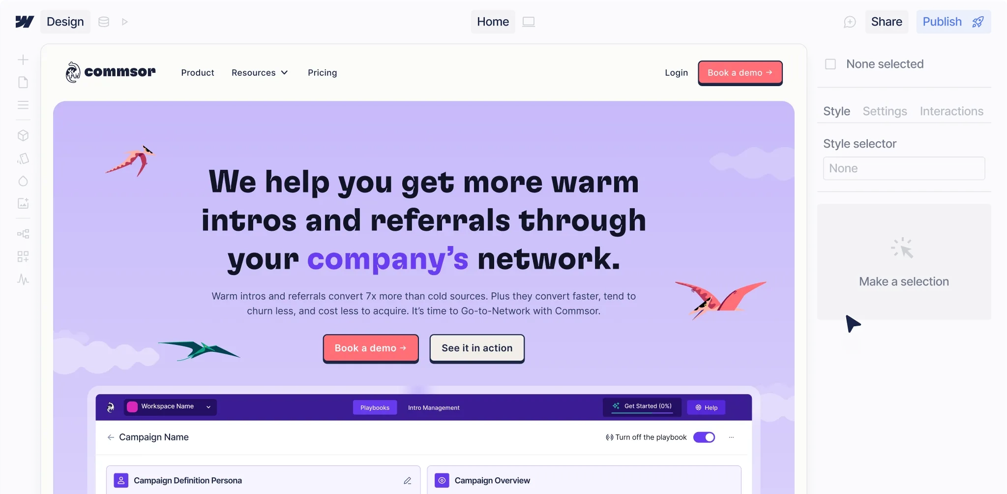
B2B SaaS is a high-consideration purchase. Prospects are comparing multiple tools, persuading internal stakeholders, and making decisions that can affect team performance and revenue. Typography becomes part of how they judge your product’s maturity and reliability.
On a typical B2B SaaS marketing site, typography needs to:
- Communicate a complex product clearly at speed
- Support a layered story: problem, value proposition, features, proof, pricing
- Scale across a growing component system and CMS-driven content
- Feel distinct enough to stand out from “yet another SaaS” while still feeling usable and trustworthy
That’s why in our website design projects, we treat type as a strategic asset that’s defined alongside your ICP, positioning and product messaging, not as an afterthought at the end of visual design.
If you’re not sure where your typography is helping or hurting conversions, you can start with a free website audit and we’ll walk through specific opportunities on your current site.
The Foundations: Hierarchy, Scale and Readability
Before you worry about picking the “perfect” font, you need a robust typography system: headings, body copy, labels and supporting styles that work together across your entire site.
1: Hierarchy that mirrors your product story
Your type hierarchy should reflect the narrative flow of your pages: what’s most important, what’s secondary, and what’s supporting detail. When we run website strategy and information architecture workshops, we first map out the sections and narrative flow of each page, then translate that into heading levels, subheads and body styles.
A strong hierarchy:
- Uses clear, consistent heading levels (H1–H4) to guide scanning
- Communicates the “big idea” of each section in a single, scannable line
- Minimises competing focal points so the user always knows what to read next
On a homepage, that usually means one primary H1, distinctive H2s for each major section, and supportive H3/H4s to label content like feature clusters, FAQs or testimonials.
2: Scales that actually scale
Your type scale needs to work on a 13‑page site and a 130‑page site. For growth‑stage B2B companies, that means designing a scale that:
- Works responsively from mobile to desktop
- Stays consistent across core marketing pages, blog content and landing pages
- Leaves room to introduce new components without inventing new sizes every time
At Overpass, we solve this by building typography into your design system: elements (fonts, weights, sizes), components (cards, feature blocks, CTAs) and templates (home, product, pricing). This makes scaling your site far easier for your internal team and reduces the risk of “typography creep” as more people add content.
If you’re planning a redesign and want a typography system that can grow with you, book a call and we’ll talk through how we build scalable design systems for B2B SaaS teams.
3: Readability > visual showmanship
B2B websites still need to feel considered and beautiful, but readability always wins. That’s especially true for sales‑led teams, where your site has to communicate complex concepts quickly to busy decision‑makers.
A few practical choices that make a big difference:
- Comfortable line length (typically 60–80 characters on desktop)
- Line height that avoids both cramped and “floaty” text
- Sufficient color contrast for accessibility and legibility
- Avoiding ultra‑light weights for body copy or important labels
We embed these decisions into your wireframes and design system so they’re not subjective opinions, but part of an agreed website specification.
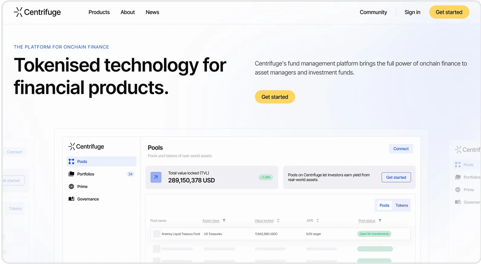
Choosing Fonts That Fit Your Brand and Category
Typography choices send strong signals about your product’s personality and category fit. For B2B SaaS, the challenge is to stand out from the sea of generic, geometric sans‑serif brands without undermining trust.
1: Start with positioning, not aesthetics
Before we ever shortlist fonts, we run strategy workshops and a 60‑question survey across brand, customer, product and category. We also visually chart your category to find open spaces you can own, then plot your desired visual axis (e.g. playful ↔ serious, classic ↔ futuristic).
Typography then becomes a tool to express that position. For example:
- A fintech serving enterprise finance teams might lean into more grounded, authoritative serifs or humanist sans‑serifs
- A product‑led collaboration tool might push towards more expressive or rounded forms, supported by friendly micro‑interactions
By the time we’re selecting fonts, we already know what “mood” your typography needs to convey, which reduces the risk of subjective internal debates.
2: Pairing fonts with intent
Type pairing is where many B2B sites go wrong: either everything is set in one utilitarian sans‑serif, or there are too many mismatched styles. We typically:
- Use one primary type family with enough weights and styles to cover headings, body and UI
- Introduce a secondary accent font only if it’s genuinely adding differentiation and is sustainable long term
- Make sure every style has a clear job: display, body, UI labels, data, code, etc.
Because we design your components and templates with type rules baked in, your marketing team can add new pages and content without breaking the system. If you’d like more specific feedback on your current pairings, you can request a free website audit and we’ll flag where typography is diluting (or supporting) your positioning.
3: Performance, licensing and scaling
For SaaS teams, typography isn’t just a design choice, it has technical and operational implications. We take into account:
- Web performance (font file weights and loading strategies)
- Licensing models that match your growth plans and traffic
- How fonts will behave in Webflow, across CMS templates and with future languages or character sets
Our Webflow‑first design and development approach means we’re always thinking about how fonts will actually perform in your live build, not just in static Figma concepts.
Using Typography To Improve Conversion (Not Just Aesthetics)
If typography lives only in the “visual design” column of your project plan, you’re leaving money on the table. The way you structure and style text directly affects time on page, comprehension and conversion.
1: Clarifying your offer and ICP
One of the biggest issues we see in audits is vague, generic messaging combined with underpowered typographic emphasis. If your headline is unclear and visually weak, visitors bounce before they understand what you do.
As part of our website redesign process, we run product messaging workshops to clarify your offer, category and ICP, then reflect that clarity in your homepage copy and typographic hierarchy. The result is bolder, more specific headlines and supporting copy that your type system elevates rather than hides.
This is one reason clients like Saasrise have seen visitors‑to‑lead conversion improvements after a redesign, in their case, a 24% uplift.
2: Guiding attention with consistent patterns
We use typography to create repeatable patterns that guide users through the journey:
- Clear visual differentiation between primary and secondary CTAs
- Consistent styling for proof points (testimonials, logos, stats)
- Predictable formatting for modules like FAQs, pricing tables and comparison sections
Because we also run heat map analysis and ongoing optimisation for clients on subscription, we see in real data which patterns keep people reading, scrolling and clicking. Typography tweaks (like making key benefit statements more prominent or simplifying dense blocks of copy) often deliver meaningful conversion wins.
3: Supporting long‑form content and programmatic pages
As your SaaS grows, content scales too: blogs, resource hubs, programmatic landing pages, comparison pages and more. Typography is crucial here: without a strong system, long‑form content quickly becomes a wall of text that’s hard to scan.
We design your article templates and programmatic layouts with:
- Clear heading hierarchies for content depth and SEO
- Distinct styling for pull quotes, callouts, in‑line CTAs and “next step” modules
- Readable body styles that work across devices and content lengths
Because we specialise in SaaS websites, we also think about how these content experiences support sales‑led funnels and product‑led adoption, not just SEO.
Building Typography Into a Scalable Design System
Great typography isn’t a one‑off “nice new font” decision, it’s part of a scalable design system that your whole team can use.
Elements, components, sections, templates
On B2B website projects, we define typography across four levels:
- Elements: core styles like buttons, body, headings, labels
- Components: cards, feature grids, forms, pricing tiles using those elements
- Sections: hero blocks, comparison strips, testimonial bands
- Templates: full page layouts for home, product, pricing and content
This means when your team needs to spin up a new landing page, they’re assembling from pre‑defined building blocks with consistent typography, rather than starting from scratch. It improves brand consistency, speed to ship and the overall user experience.
Supporting ongoing optimisation
Most B2B websites aren’t “done” at launch. You’ll add new features, refine your messaging and iteratively improve conversion rates. When typography is wired into your component system, you can:
- A/B test messaging without visually breaking your pages
- Roll out improvements to headings or body styles globally
- Maintain accessibility and consistency as your team grows
As part of our subscription model, we combine design and Webflow development with ongoing optimisation, so typography, layout and messaging evolve together instead of drifting apart over time.
If you’re interested in a partner who manages the whole website (strategy, design, development and data-led optimisation) book a call and we’ll explore whether our website design subscription is a fit.
When To Refresh vs. Redesign Your Typography
Not every site needs a full rebuild. Based on your current website maturity and performance, typography improvements can fit into either a refresh or a ground‑up redesign.
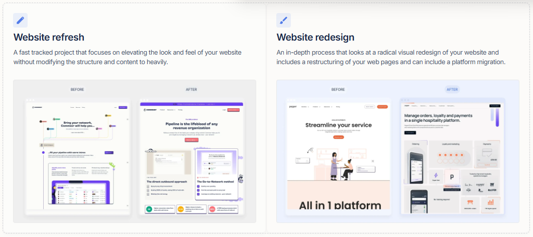
Website refresh: elevating what you already have
If your overall structure and messaging are working, but the site feels visually dated or inconsistent, a fast‑tracked website refresh can help. In this type of project, we keep your information architecture largely intact but elevate the look and feel, often through updated typography, colour, components and product visuals.
This is ideal when:
- You need to improve perception and trust quickly
- You’re not ready for a full platform migration
- Your core story is solid, but the presentation lets it down
Typography changes here might include updated pairings, a more robust type scale, improved CTAs and better treatment of proof points; all achievable in a compressed timeline.
Website redesign: rethinking structure and story
If you’ve outgrown your product, repositioned your brand or need to migrate platform (for example, to Webflow), a full website redesign is usually the right move. In these projects, we revisit everything from ICP and messaging to information architecture, wireframes and visual design. Typography is designed alongside the new structure rather than layered on top.
We guide you through:
- Strategy workshops and surveys to align the business, product and brand
- Website strategy and page‑level specifications
- Low‑ and high‑fidelity wireframes
- Visual design, including art direction, stylescapes and UI concepts
- A fully‑defined typography system embedded in your design system and Webflow build
Next Steps: Get Clear On Your Typography Strategy
Typography is one of the most leveraged parts of B2B web design: it shapes how your story is told, how your brand feels and how effectively your site converts. For growth‑stage SaaS companies, that means moving beyond “does this font look nice?” to “does this system support our positioning, our pipeline and our long‑term website roadmap?”
If you suspect your current typography is holding your website back, you have two simple next steps:
- Request a free website audit to get specific, actionable feedback on your current site
- Book a call to discuss a website refresh or full redesign, including a scalable typography and component system tailored to your ICP and growth plans
Both are low‑commitment ways to see how a specialist B2B SaaS website design studio can help you turn typography from a cosmetic choice into a conversion asset.
Explore our B2B Web Design Services
Get in touch