Using colour to create a strong SaaS brand identity
Master SaaS brand colour psychology. Learn to build a stronger brand identity that builds trust and drives conversion.

SaaS companies have a colour problem. Not a shortage of choice. Quite the opposite. Browse the brand pages of fifty B2B SaaS products and you'll encounter an ocean of navy blue, trust-signalling grey, and the occasional brave mint green. Colour psychology plays a major role in brand recognition, yet most SaaS founders treat their brand colour palette as a last-minute decision; something to confirm before launch rather than a strategic asset that shapes how buyers feel about their product at every touchpoint, from the first LinkedIn ad to the product onboarding screen.
When Seb Vissers came to us at Overpass to build the brand identity for Caide (an AI-powered virtual campaign manager for sales teams), the first question we asked wasn't "what colours do you like?" It was: "what do you want your target audience to feel when they see your product?" That distinction, as Frankie Hildrick our Senior Designer puts it, is the difference between a brand colour palette that looks fine and one that actually works.
"In visual perception a colour is almost never seen as it really is, as it physically is. This fact makes colour the most relative medium in art." - Josef Albers
For SaaS founders and marketing leaders, this isn't just philosophy. A SaaS brand identity colour palette has to do something consumer brands don't always need to: build trust at a glance, signal the product category clearly, and still stand out from a sea of competitors who've all read the same colour psychology guide. That's a harder brief than it sounds, and it's exactly why so many SaaS brands end up with brand colours that feel safe but forgettable.
You need only look at our use of language to see the role colours play in our lives. "A golden opportunity", "a red-herring" or "it came out of the blue". Good design roots itself in the knowledge that colour is not only descriptive but symbolic too. It understands that gold, alongside being the shiny thing medals are made of, can imply positivity, quality or wealth and that red can suggest caution or danger.
Designers look to identify the colour schemes that guide audiences to feel a certain way, often before they even know what they're looking at. In this article, we're looking at the two main schools of thought around colour. One concerns itself with the way in which colours play with our feelings whilst the other looks to understand how colours interact when placed together. It's head versus heart, it's logic versus feelings.
We'll use both to select palettes that enhance your brand visuals and draw an audience into your story.
What do you want people to feel? (Colour Psychology)
The ways in which colours make us feel have both biological and sociological origins. With each new experience, we begin to form new ideas about the colours around us and what they mean. It's important to note then, that colours are situational; that is to say, our reactions to them are determined by the context in which we see them.
Red can mean love in one context, but danger in another. Blue can elicit serenity, promote trust or induce sadness. Before asking what colours your brand should use, it's important to identify which context you are presenting them in and what you'd like an audience to feel.
While there aren't hard and fast rules, here's a useful guide to some of the more common associations. Keeping these in mind when looking at your palette of choice is a good first port of call. If you're offering 'rewilding experiences', you could look to an earthy calming colour palette. Or possibly you run a challenger tech startup and should look for punchy vibrant colours
In the B2B SaaS market specifically, brand colour psychology tends to cluster around a handful of defaults, and understanding why helps you decide whether to follow convention or deliberately subvert it.
A 2025 peer-reviewed study of 285 consumers (Gupta et al., Journal of Marketing & Social Research) found that blue triggers associations with trust in 74% of participants and rates 6.2 out of 7 for appropriateness in financial services, while green leads for eco-focused product categories with 88% of participants associating it with environmental responsibility.
Beyond those specific findings: orange tends to communicate energy and warmth, bright yellow draws attention and projects optimism, and purple performs consistently well for premium and creative brand positioning. Even a bold, warm orange (the punchy version of the hue) can work brilliantly for challenger brands wanting to project boldness.
Here's the counter-intuitive truth we've seen proven across the 50+ SaaS brands we've worked with at Overpass: because so many products default to blue, a well-chosen alternative brand colour scheme can now be a stronger trust signal than blue itself. It demonstrates that you know your market well enough to stand out in it. Many brands make the mistake of choosing blue because "it feels safe", but safe and trustworthy are not the same thing. Your target audience expects differentiation as much as credibility. The right colour choices communicate both.
Case study · Brand Identity · Caide, Sales Intelligence SaaS
When Seb Vissers brought Caide to us for their brand identity, we ran our Brand ID workshop and presented three distinct brand territories, each with different brand colours, a different brand personality, and different brand personality traits. The chosen route featured warm amber-and-charcoal brand colours anchored by a bespoke dog mascot: the idea that Caide was your guide on this new business adventure. The target customers were experienced campaign managers who'd spent entire careers surrounded by corporate blue. The warm palette immediately differentiated Caide from every other AI sales tool in the market, communicating "guide, companion, intelligent" in a way that default blue never could.
"We entrusted Overpass Studios with our brand identity as an early-stage startup. Their Brand ID workshop enabled us to clearly express our expectations. We were immediately impressed with the three brand routes they presented, making the refining process smooth and efficient. The final result exceeded our expectations."
Seb Vissers, Founder & CEO, Caide
Which colours work together? (Colour Science)
You might have never heard of colour science, but that doesn't mean you haven't used it. For example: "Hey, does this shirt go with these jeans?".
With the obvious caveat that you should always avoid double denim, here's how to use a simple tool to ensure that your outfit (or your new brand) has colours that work well together.
Emerging in the 18th century, the colour wheel was created to give us an idea of how colours sit in reference to one another. We could dive down a rabbit hole of details and options but today we'll stick to the three main combinations you should be aware of.
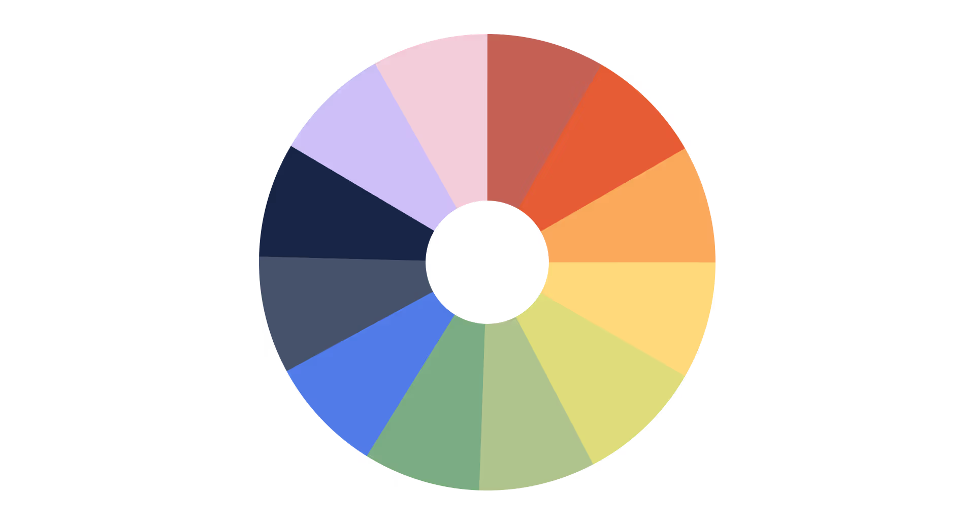
- Complimentary colours always sit opposite each other on the colour wheel and stand out when used together. It's why hundreds of blockbuster movies use a teal and orange colour grade to make different scenes pop. We recommend using one of the colours to accent the other, whether that's the button on a website or the logo on a jacket - just be careful not to overdo it!
- Triadic colours are equally spaced around the colour wheel and work well when you want vibrant and playful combinations that also work harmoniously (think Superman's costume).
- Analogous colours are the colours next to each other on the wheel. They're less bold and you should reach for these combinations if you're looking to create a uniform brand that is calm and aesthetically pleasing.
We'd recommend having a play with different colour palettes using Adobe's free tool.
For SaaS brands, each approach plays out differently depending on your go-to-market motion and target audience. All colour combinations work; the question is which works for your specific brand strategy:
A useful rule of thumb for applying colour combinations across a brand kit is the 60-30-10 rule: 60% neutral colours to reduce visual fatigue and let content breathe, 30% primary colour for brand recognition across all key touchpoints, and 10% accent colour to highlight calls-to-action and draw attention where it matters. The 60-30-10 rule for colour palette design applies whether you're building a logo website, a product dashboard, or a social media template library. A brand colour palette of four to six colours maximum is generally the right combination: enough variety to be expressive, few enough to stay coherent.
Blue is blue, or is it?
Colours, for lack of a better phrase, aren't black and white. In fact, if you look at the spectrum of light, white is a combination of all colours, and black is a total absence of colour. Facebook's blue isn't the same as Twitter's blue and McDonald's red is quite different from Coca-Cola's red. We don't have bespoke words for every shade of every colour and thank goodness, '50 shades of grey' wouldn't have had a very catchy title if we did.
Once you've determined which colours might create the emotions you'd like people to feel, it's time to consider which "versions" of those colours you would use. Would you like them to be vibrant or muted? Would you prefer brighter or darker shades? Could your blue move slightly more towards green?
Our newsletter, for example, has the colour code #F2F4FF, that's a very desaturated, light shade of bluey-purple. But we'd suggest leaving the technical lingo to the designers. Again the most important thing for you to consider is how it makes you feel.
Case study · Brand Identity · Topanga, Hospitality Tech SaaS
This is exactly the conversation we had with the Topanga team: a Los Angeles-based foodservice technology company founded in 2021, trusted by over 90 dining programs across the US, and backed by an $8 million Series A. Topanga aims to transform the $27 billion food waste and packaging problem through AI-powered sustainable models. When they came to us, their brand visual identity felt like a first draft: technically fine, but not distinctive enough for a company with that level of ambition. The updated brand colour palette we created gave a nod to Topanga's roots in sustainable foodservice while setting them apart from every other eco-tech brand in the market, using different shades of their existing hues combined with new graphic expressions that brought their AI positioning to life.
"Overpass helped us not only launch a beautiful, engaging website, but also reimagined our brand. The end result exceeded our expectations: a brand and digital presence that feels modern, cohesive, and authentic."
Hayley Bance, VP Experience & Design, Topanga
How you document your colour choices matters as much as the choices themselves. A proper brand kit should specify every colour in multiple formats: hex colour codes for web (your logo website, product UI, and social media templates), RGB for digital display, and CMYK for any printed materials. It should define colour variations, showing how your primary and secondary colours behave on dark versus light backgrounds, and set clear brand guidelines on minimum contrast ratios for accessibility.
Consistent use of a brand colour palette across all communication channels significantly increases brand recognition; research shows figures of up to 80% improvement when colours are applied with discipline across all brand touchpoints. Create clear brand colour guidelines for your design team and any external partners so the right combination appears everywhere it should, not just on the logo.
What SaaS brands can learn from iconic colour strategies
Before diving into the pencil case and going crazy with the crayons, look at some of your favourite brands and consider their use of colour. What combinations have they used? Are their colours energetic or calm? Ask yourself: how do they make me feel?
We all safely assume a red fizzy drink is Coke and a purple bar of chocolate is Cadbury's. Apple's professional products come in grey, silver and gold whilst their cheaper alternatives come in fun vibrant colours. And there's that particular shade of yellow that's unanimous with power tools and diggers - McDonald's yellow arches being the ultimate example of brand recognition through a single dominant colour. When you start to see how colours change your own thoughts, you'll get a greater understanding of how you want to apply them yourself.
For SaaS founders, the exercise is the same, but your reference points should be different. Rather than Coca-Cola or Cadbury's, look at the brands you compete with and the brands your target buyers and ideal customer profiles genuinely admire. What logo colour combinations do they use? Where does navy blue dominate your category? Where are the brands using bold colour to stand out from the pack?
The most instructive logo colours inspiration often comes from SaaS brands that deliberately broke with category convention and won. Stripe's gradient violet logo on a white field told the payments market this wasn't another grey enterprise platform. Monday.com's multi-colour identity communicated "work can be colourful" at exactly the moment remote work had drained everything of personality. Intercom's move from blue to dark charcoal signalled a deliberate shift upmarket to enterprise. None of these were accidental brand colour choices; each was a deliberate brand positioning decision expressed entirely through colour.
What this means practically: before finalising your brand colour palette, list your top ten competitors and map their dominant colour, secondary colours, and logo colours. If all the logos on that list are mid-blue, that's your differentiation opportunity. If many brands are using bright yellow for disruption, it may be time to look elsewhere. Your brand colours should feel like a deliberate statement about where you sit in the market, and the best brand colour palette inspiration is often found in the whitespace your competitors have left behind.
What is the brand colour palette rule? The 60-30-10 method for SaaS
If you've done any reading on colour theory, you've likely encountered the 60-30-10 rule. It's the closest thing to a universal brand colour palette rule, and it holds up across logo design, website layout, product UI, and marketing content alike.
The rule works as follows: 60% of your visual space is dominated by neutral colours (white, off-white, light grey) to reduce visual fatigue and let your content breathe. This keeps the interface from feeling overwhelming and ensures your brand colours appear where they should, as signal rather than noise. 30% goes to your primary colour, the most recognizable element of your brand identity, the one that appears on your logo, your primary CTA buttons, and your core marketing materials. The remaining 10% is for accent colours and secondary colours: the bold colour on a feature callout, the hue that draws attention to a conversion point, or the colour variation that adds personality to supporting visuals.
The difference between a brand colour and an accent colour is simple: your brand colour is about recognition, your accent colour is about action. Brand colours should appear consistently across all channels, your logo website, your social media graphics, your email campaigns, your product. Accent colours earn their impact precisely because they appear sparingly. Use them everywhere and they become the background; use them in the right combination and they become the thing that makes users click.
For SaaS products specifically, you'll also want to define semantic colours: the green that signals a successful action, the amber that warns of a potential issue, the red that flags an error. These exist outside your brand colour palette but need to work alongside it harmoniously. Different cultures interpret colours differently, which matters if your SaaS product has a global user base: green means "go" in Western markets, but colour meanings vary significantly across different cultures. Factor this into your accessibility review.
On accessibility: if your primary colour or accent colour creates insufficient contrast against your background, you'll fail WCAG 2.1 AA standards (which require a contrast ratio of at least 4.5:1 for normal text and 3:1 for large text). Enough contrast isn't just a legal consideration; it directly affects whether your intended audience can actually read and engage with your product. Test colour combinations in real UI early, not just on a brand board, because different shades behave differently at screen resolution than they do in Figma.
Our 4-step process to the perfect colour palette
- Identifying what you want people to feel. Is your brand energetic? Is it calm? Is it playful?
- Take this and apply your knowledge of colour psychology to find a primary colour which could make people feel this way.
- Using the colour wheel, find two other colours that work alongside your primary.
- Kick back with a cup of tea and admire your brilliant work.
For SaaS brands specifically, we'd add a few steps before you get to the tea:
Before step 1 - describe your brand in human terms. Not "innovative and trustworthy". Every SaaS product says that. Instead, think about how you want your ideal customer to feel after their first ten minutes with your product. "Like they've found someone who actually understands their problem." "Like they're ahead of their competitors." "Like the complexity just disappeared." The more specific you can get when you describe your brand, the better your colour choices will be, because you're designing for a specific emotional state, not a generic one.
Before step 3 - carry out a competitor colour audit. List your top ten competitors, identify their dominant colour and any secondary colours, and look at their logo colour combinations. Where does the market cluster? Where are the brand colour palette inspiration gaps? You're looking for the colour combinations that no one in your category is using but that would still resonate with your target customers. That's where brand differentiation lives.
After step 4 - test in real UI, not just mockups. colours that look brilliant in a brand colour palette presentation can behave completely differently when applied to a product dashboard. Warm colours and bold colour choices can become visually fatiguing at scale. Neutral colours that seemed boring in isolation become exactly what your users need when they're staring at complex data for six hours. Always test your colour scheme in context before finalising your brand guidelines.
At Overpass, when we run our Brand ID workshop with SaaS founders, we present three distinct brand territories, each with a different colour palette, a different brand personality, and a different set of brand personality traits. By the time a founder chooses a direction, they've experienced the difference between an analogous palette that communicates "enterprise stability" and a complementary palette that says "disruptive challenger."
They've felt the difference, not just seen it. The right combination isn't the one that looks best in isolation. It's the one that most accurately communicates your brand strategy to the specific audience you're trying to reach.
Now you've got the fundamentals. Let's get colourful. 🌈
If you're a B2B SaaS company working through your brand identity and want to explore how a distinctive brand colour palette could help you stand out and convert more visitors into leads, take a look at our website design service or book a call with Matt, our Creative Co-founder, to discuss your project; you'll have a plan and a free quote within five working days.
Get in touch


![6 Best Webflow Agencies For B2B SaaS [With Reviews]](https://cdn.prod.website-files.com/63f4f8b3637ca34b3b597dcd/6972206f4a7f922c730f7b66_max-brown.avif)