How To Optimise a Webflow Website For SaaS Conversions
Turn your Webflow SaaS site into a conversion engine with practical, data-driven tweaks you can ship in days, not quarters. Read now.

Most SaaS Webflow sites don’t need a full redesign to convert better – they need clearer stories, fewer distractions, and a bit of ruthless data. This guide walks through practical, founder-friendly tweaks you can ship in days, not quarters, to turn your Webflow marketing site into a repeatable conversion engine.
Book a Webflow demo call
How To Optimise Webflow Website For Conversions in B2B/SaaS
1: Start with the right conversion goals
Before touching a pixel, decide what “conversion” actually means for your SaaS – and where it should happen on the site.
- For sales-led B2B SaaS, primary conversions are usually demo booked, trial started, or qualified lead capture (e.g. pricing or solution request).
- Secondary conversions (newsletter signups, resource downloads, low-friction “get pricing” forms) warm up visitors who aren’t ready to talk to sales yet.
- Map each key page (home, features, pricing, integrations, blog) to a single primary CTA so the page has one job, not twelve.
In Webflow, this should translate directly into a small set of high-intent forms and buttons you track obsessively, rather than 20 different micro-actions no one really cares about.
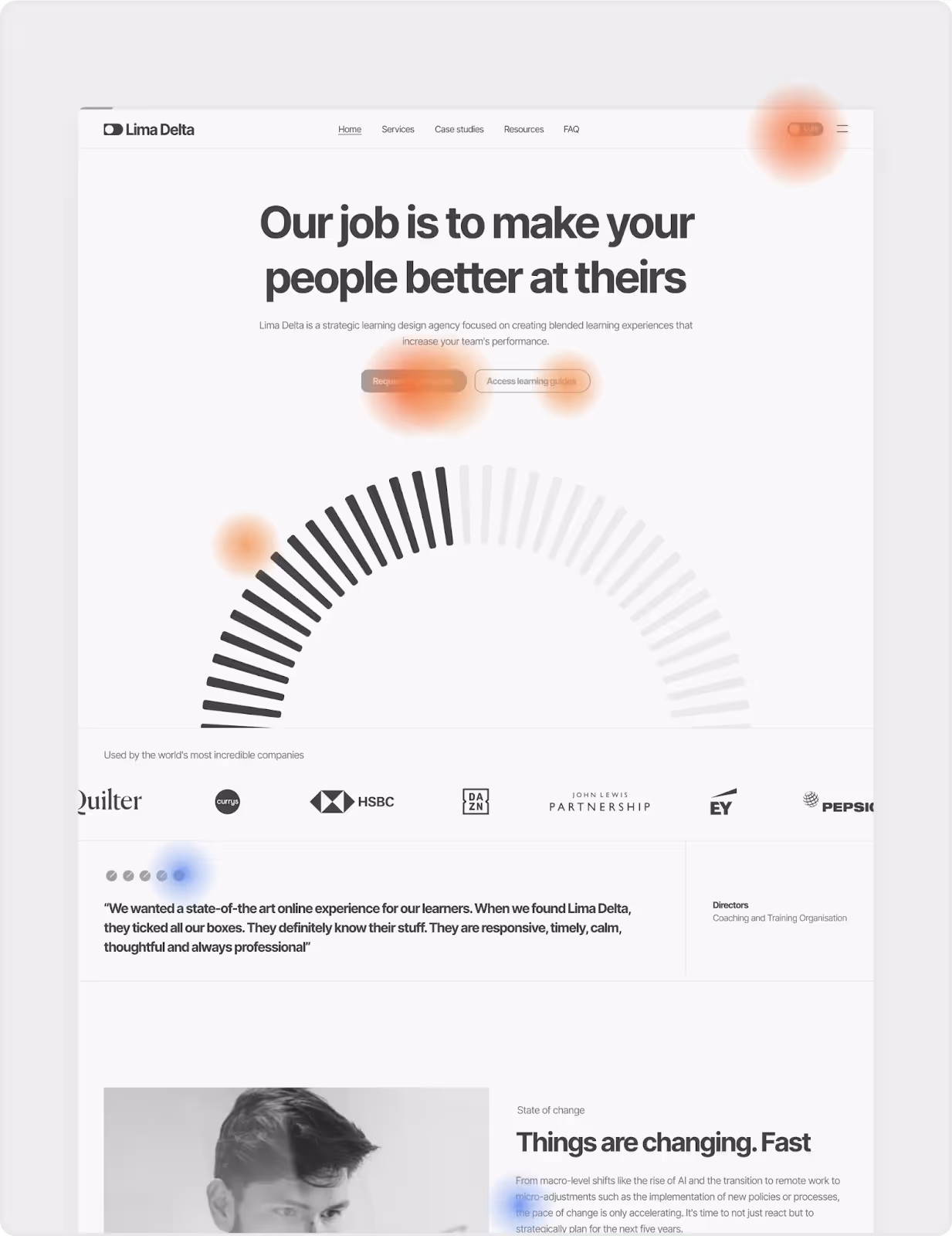
2: Fix the foundations: speed, UX and structure
If the basics are broken, no clever headline will save conversions. Webflow gives you a lot out of the box, but SaaS sites are notorious for heavy dashboards, autoplay videos and script soup.
- Optimise performance first: compress images to WebP, use SVG for UI and logos, enable minification for CSS/JS/HTML, and lazy-loading for non-critical images or demo assets. This boost to user experience will help not only with conversions, but also aid visibility in search results.
- Make navigation buyer-centric: group content by value (Solutions, Use cases, Product, Pricing, Resources) instead of your org chart. Keep top-level nav lean and always surface a single primary CTA (e.g. “Book demo”).
- : keep hero sections focused, avoid carousels for core messaging, and use consistent spacing and typography via a modular design system so every new page feels familiar.
Overpass’s Webflow builds lean heavily on a component-first, modular structure, which makes it easy to keep layout consistent while you experiment with new pages or sections.
3: Nail the SaaS story on key pages
Most SaaS Webflow sites lose conversions because the story is fuzzy, not because the design is “ugly”. Focus on clarity, not cleverness.
Home page: instant clarity
Your home page has one job: make the right people say “this is for me” within 5 seconds.
- Use a simple, specific hero formula: “Who it’s for + what outcome + how it’s different” (e.g. “Revenue operations teams automate deal health with one connected workspace”).
- Swap vague CTAs (“Learn more”) for high-intent actions that match the visitor’s stage: “Book live demo”, “Start free trial”, or “Talk to sales”.
- Bring proof above the fold: logo rows, short quantified outcomes, and 1–2 sharp testimonials are far more powerful than a generic trust badge graveyard.
Features page: problems, not features
Founders love listing features; buyers care about solved headaches.
- Structure each section as “Problem → Outcome → How it works”, with screenshots or short loops that show, not tell.
- Group features by jobs-to-be-done (e.g. “Pipeline visibility”, “Customer onboarding”) rather than internal modules – this mirrors how buying committees think.
Pricing page: reduce anxiety
Pricing pages are where good pipelines go to die if they’re confusing or vague.
- Make your “recommended” plan visually dominant and clearly aligned with your ICP’s typical use case.
- Answer objection questions inline: “What happens after trial?”, “How long does setup take?”, “Can we start self-serve then move to enterprise?” – use FAQs, tooltips, and small explainer copy.
- Add a low-friction path (“Talk to sales” or “Get custom quote”) for complex deals so buyers don’t bounce when they realise their org is weird (because it is).
Overpass’s CRO work focuses heavily on aligning messaging and information architecture with how B2B SaaS buyers actually evaluate and compare products.
4: Use Webflow as a conversion lab, not a brochure
Webflow shines when you treat it as a testing ground rather than a static brochure. Small, frequent experiments compound into big conversion lifts.
Build for experimentation
A modular Webflow system lets you move fast without breaking everything.
- Create reusable sections (hero variations, social proof bands, feature rows, pricing comparisons) as components you can slot into new landing pages in minutes.
- Standardise CTAs and form blocks as symbols/components so copy and tracking stay consistent while you play with placement, offers and designs.
This is the same component-first approach Overpass uses to deliver flexible, scalable builds that still stay on brand when marketing spins up new pages weekly.
Integrations that make your data useful
Your Webflow site is only as smart as the tools plugged into it.
- CRM integration (HubSpot, Salesforce): push form submissions with clean field mapping so sales can qualify quickly and you can attribute revenue back to specific pages and campaigns.
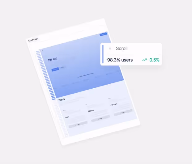
- Analytics and event tracking: connect Google Analytics or similar via Google Tag Manager, set up key events for form submissions, demo clicks, pricing button taps, and scroll depth on key pages.
- Session recordings and heatmaps: tools like Hotjar or similar help you see where people rage-click, ignore, or get lost, which is gold for prioritising CRO fixes.
Overpass typically recommends routing scripts via Google Tag Manager so you can tweak tracking without constantly shipping new Webflow builds.
5: Run data-driven CRO without burning out
You do not need a full-time CRO team to improve conversions – but you do need a simple, repeatable rhythm.
Define your CRO “operating system”
Think in 4–6 week cycles rather than one-off projects.
- Pick one core metric per cycle (e.g. demo booking rate from homepage, trial start rate from pricing, MQLs from paid landing pages).
- Use analytics and heatmaps to find the biggest leaks (high-traffic page + low conversion = opportunity).
- Create 1–3 specific hypotheses per cycle, like “Adding quantified proof near the primary CTA on the home page will increase demo clicks by 15%.”
Test what actually moves the needle
Not all tests are equal. Focus on changes visitors can feel.
- High-impact test ideas for SaaS Webflow sites:
- Hero headline and subcopy clarity.
- Primary CTA text and placement (e.g. introducing a sticky bar for “Book demo”).
- Social proof near conversion points (pricing, forms, exit-intent modals).
- Shortening or restructuring forms (multi-step forms often convert better than long single pages).
- Use A/B testing either via third-party tools or marketing platforms to validate the big swings, not pixel tweaks.
Overpass’s CRO subscription model leans on exactly this approach: consistent A/B tests, heatmap and funnel analysis, and monthly strategy sessions, rather than random acts of optimisation.
When to bring in a Webflow + CRO partner
There’s a point where DIY tweaks hit a wall – usually when you’re juggling fundraising, hiring and GTM while trying to run experiments from inside Webflow at 11pm.
Signs you’ve outgrown DIY
- You have solid traffic but flatlining demo or trial conversions despite “trying everything”.
- Your Webflow site is hard to maintain, with duplicated layouts and inconsistent components that make every small change painful.
- Sales keeps saying “the website doesn’t reflect what we actually sell” – a huge red flag for messaging and ICP alignment.
What a specialist studio like Overpass brings
A studio that lives at the intersection of Webflow, B2B SaaS and CRO will typically offer:
Overpass in particular specialises in B2B SaaS marketing sites, combining Webflow builds with CRO and ongoing experimentation so founders can focus on building product and closing deals, not debugging tracking pixels.
If you want to turn your Webflow site into a SaaS conversion engine rather than a pretty brochure, start by tightening your story, cleaning up your UX, and wiring in the right data – then iterate relentlessly. When you’re ready for a partner to own the experimentation cadence, Overpass’s Webflow service and CRO optimisation service are built exactly for that.
Book a 15-minute intro call →
Get in touch